Check out our Top Rewards Cards to boost your points earning and travel more!
Last summer Chase personal accounts were force converted to a clunky new website. It is the typical tablet-focused design intended to impede productivity. There was no converting back. Business accounts were spared.
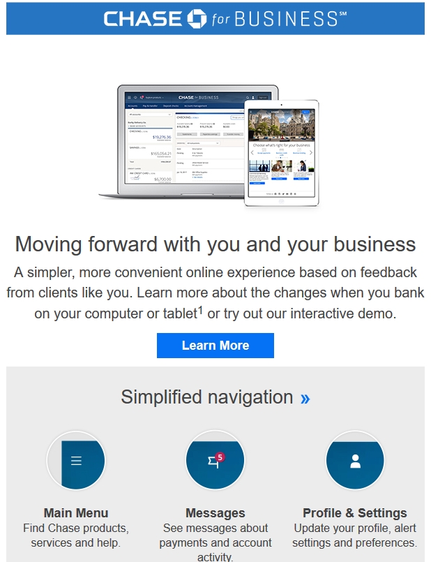
My inbox today received notice that days are numbered for business accounts. Here’s the business demo. You need not click if you have been fighting the personal site for the past year.
My two Chase business accounts still load to the old site and no date is given for the switch.
Instead, how about they make credit card transaction activity available for more than 90 days?
Or, how about they waive 5/24 for one card approval per account subjected to the new site? 🙂
Check Out Our: Top Rewards Cards ¦ Newsletter ¦ Twitter ¦ Facebook ¦ Instagram


The new (not so new anymore) layout is HORRIBLE. You cannot navigate “back to search results”!!! I do banking and bank bookkeeping for a living and the site is the most UN-user friendly site I have EVER used in my life. I used to PRAISE Chase for their website. The new format SUCKS
Worst website navigation problems I can even imagine. Can’t access my past transactions in order to update my account register. Customer service rep no help.
[…] at Rapid Travel Chai reported yesterday that he had received an email indicating this change was coming to his account. While […]
[…] Rapid Travel Chai reports that he received an e-mail stating that business accounts would be moved over to the new Chase website design soon. Stefan is not a fan of the new design at all (I don’t think it’s as bad as the American Express once). What people should really care about though is that the new website design lets you view ‘Selected For You’ offers, previously if you held a business card in the same login you saw the old design and weren’t able to view these offers. […]
designed to help chase, not the customers it seems